

Inside Unika* Studio’s Latest Projects
Lisbon-Based Unika Studio:
Where Stories Find Their Shape, and Brands Find Their Voice
—
Unika* Studio is a communication and design studio based in Lisbon, Portugal, known for turning brand strategy into immersive, emotionally resonant experiences. From initial concept to final content, the studio redefines branding as more than visual identity—it becomes a language of place, rhythm, and story.
With a practice rooted in Lisbon’s creative culture, Unika* combines emotional intelligence with strategic design thinking to build brands that feel both intentional and memorable. Each project reflects a balance of beauty, narrative, and cultural context, allowing brands to connect with people in meaningful ways.


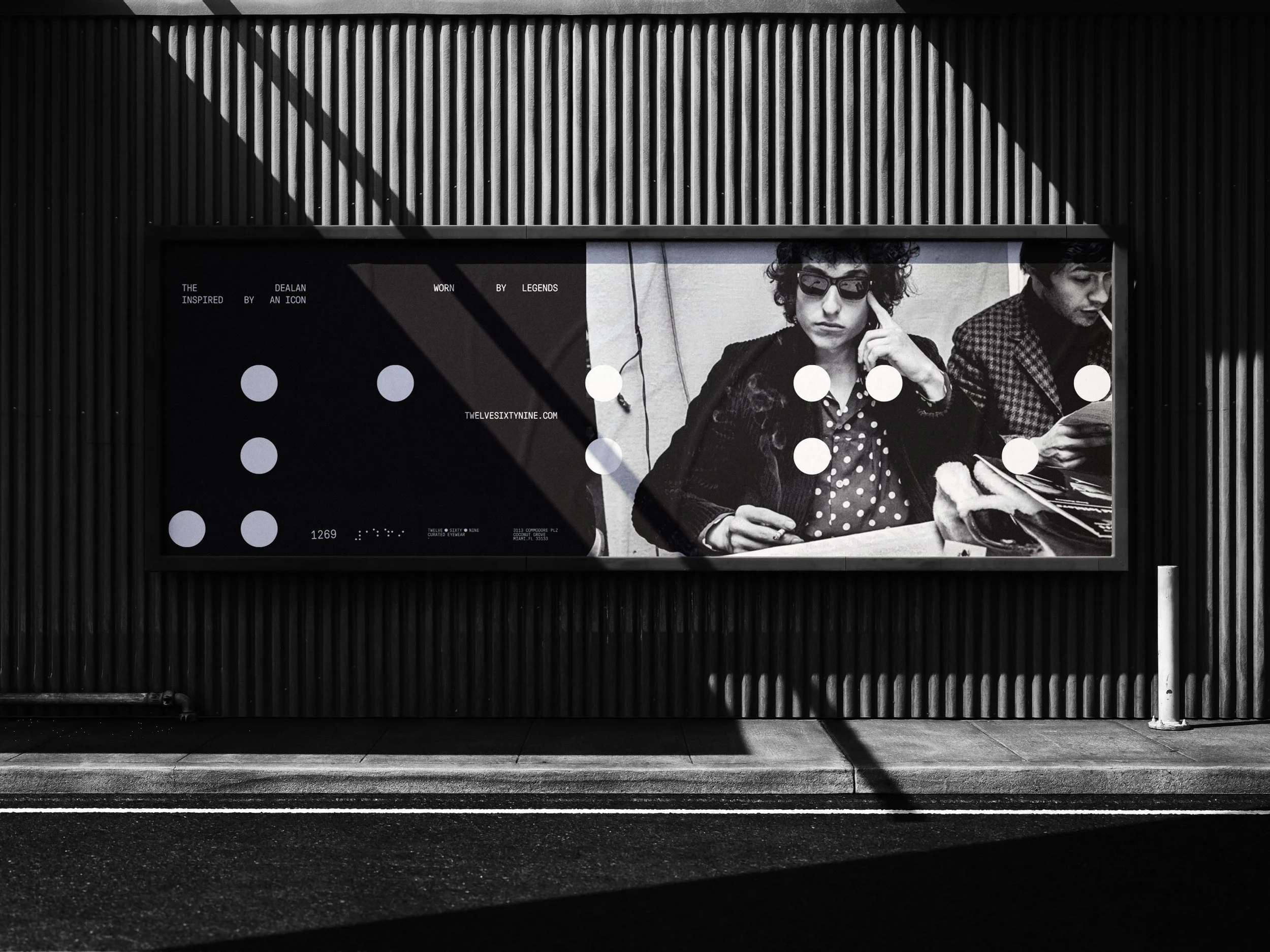
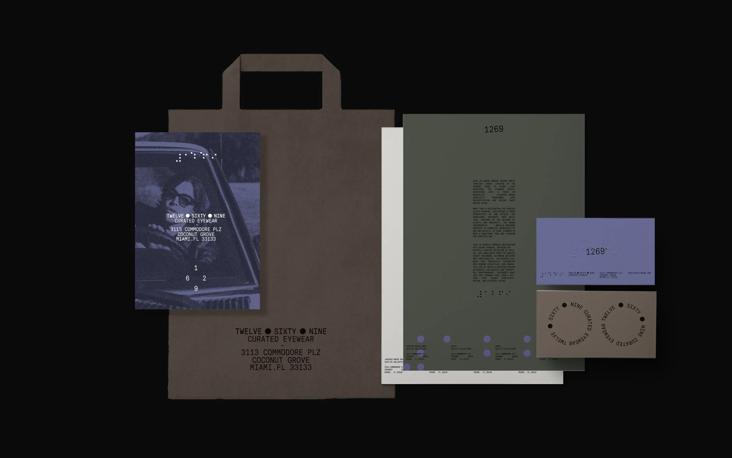
1269 — A Brand That Redefines Perception
At 1269, it’s not just about selling sunglasses—it’s about helping people fall in love with eyewear. Every piece in the store is carefully chosen for its craftsmanship, character, and timeless design. Through a meticulous curation process, the team ensures that every frame is the right fit for their vision and their clientele.
To express this ethos, Unika* created a brand identity that plays with perception—both literal and emotional. Drawing inspiration from the duality of sight and touch, the visual language incorporates Braille as a central motif. It’s a powerful reminder that true understanding goes beyond what the eye sees. The identity invites a slower, more intentional experience of luxury: refined, tactile, and deeply considered.


Juni Coffee — A Visual Identity Built from Ritual & Rebellion
In the heart of Paris, Juni Coffee is a daily ritual, a design-forward refuge and a quiet rebellion against bad coffee. With the bold tagline “Anti-bad café club,” Juni is a new kind of coffee space.
To bring this vision to life, Unika* developed a dynamic visual identity that channels the rhythm of Parisian mornings. The brand language fuses duotone palettes, layered textures, and expressive hand-lettered typography—bringing warmth, motion, and boldness to every touchpoint. From animated poster series to in-store brand details, the system Unika* created feels alive, intimate, and unmistakably Juni.
Rooted in small moments—a porcelain cup, a striped coaster, a bright yellow bird—the branding captures the beauty of daily rituals. The result is a coffee brand that feels Parisian to its core, emotionally resonant, and delightfully unexpected—just like a great cup of coffee in the right place, at the right time.


NOA — Korean Culinary Artistry, Reimagined in Bali
Set against the lush backdrop of Bali, NOA offers an immersive taste of Korea through an intimate omakase experience. Known for its exceptional cuts of marbled meat and multi-course culinary storytelling, NOA blends tradition with innovation, curating a dining journey that feels both grounded and elevated.
To bring this vision to life, Unika* led the development of the brand identity, strategy, and print materials. The result is a refined visual system that mirrors the precision and elegance of Korean omakase. From tactile textures to minimal yet meaningful typography, the identity evokes balance, depth, and quiet sophistication. Every design element—from the logo to printed menus—was crafted to reflect the harmony of flavour, ritual, and atmosphere that defines NOA.
Through thoughtful strategy and elegant execution, Unika* created a brand that bridges continents—rooted in Korean tradition, experienced in the heart of Bali.


Pier One Rum — Labels with the Spirit of the Caribbean
Pier One Rum is a celebration of Caribbean heritage, captured through striking visuals, layered textures, and storytelling that goes beyond the bottle.
Unika* was commissioned to design the label system, creating a standout shelf presence that fuses exploration with elegance. From deep blues to vibrant reds, each label features custom silhouettes and hand-drawn animal motifs: the cheetah, symbolising boldness and refined aging; the toucan, evoking clarity and tropical vibrancy; and the iguana, representing earthy depth and groundedness.
Unika’s design approach paired vintage forms with contemporary contrasts—resulting in labels that feel crafted, compelling, and collectable. The visual identity doesn’t just decorate the bottle; it reflects the complexity, clarity, and character of the rum inside.


If you enjoyed this article, you should check out the article UNIKA* STUDIO, an office of creativity and design


